ShopDreamUp AI ArtDreamUp
HZ-ink has limited the viewing of this artwork to members of the DeviantArt community only.
You can log in or become a member for FREE.
Deviation Actions


Description


Commision is open!
 Please Check It Out
magician1999.deviantart.com/jo…
Please also check my other arts:
:origin()/pre08/2f3c/th/pre/i/2015/285/1/f/summer_by_magician1999-d9cwln4.jpg)
:origin()/pre04/6d8e/th/pre/i/2015/285/b/6/goldfish_hime_by_magician1999-d9bdjx6.jpg)
:origin()/pre15/0818/th/pre/i/2015/278/5/b/girl_s_talk_by_magician1999-d9b9klr.jpg)
Image size
1000x1413px 858.89 KB
© 2015 - 2024 HZ-ink
Comments27
Join the community to add your comment. Already a deviant? Log In
Wow, this is truly gorgeous <img src="e.deviantart.net/emoticons/s/s…" width="15" height="15" alt="
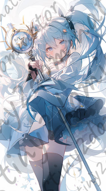
The arrangement of the paper tags(I'm sorry I don't know the exact term) adds a lot of visual interest. The way the eye falls down through the piece in an almost lazy zig-zag motion is very appealing. Good job on your blurring around the foremost tags and foliage, you perfectly drew the viewers eye to the main subject.
The subject herself is well drawn, her expression is completely on-point and completes the overall mood. The texturing of the little white dots(snow I assume) especially on her face ..pulls it all together somehow.
Color wise I think it's very good. The pink with white and blue accents is aesthetically beautiful. It doesn't come off like cotton candy, instead it stays true to the peaceful praying mood you have going on. I will say that Miku's shading seems very soft and well blended, whereas the tags are very flatly colored in contrast. I don't know if that is a bad thing per se, that maybe with the flat coloring it creates a sharper contrast. Or if it was more uniformly shaded it would be better off. I know it definitely doesn't make the piece look bad, though.
The backlit lighting also is very well done <img src="e.deviantart.net/emoticons/s/s…" width="15" height="15" alt="